

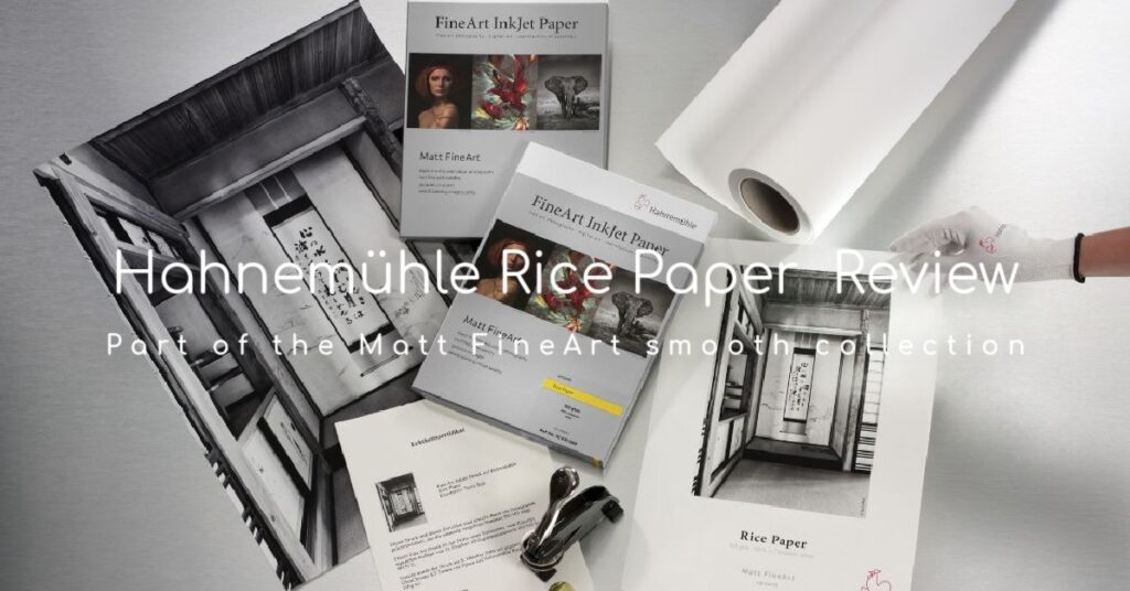
The Hahnemühle Rice Paper is part of the Matt FineArt smooth collection. The papers in this Collection are as diverse as the images printed upon them. The first thing that I noticed when compared to other Hahnemühle papers is that the Rice Paper is very thin, 100gsm. It has a semi-opaque quality to it with a delicately textured matt surface. This paper reminds me a lot of the Japanese rice paper screens which are a tradition in Japanese architecture. The official name for the Japanese rice paper screens is called a Shoji screen and consists of a thick, translucent paper stretched over a wooden frame and because of its semi opaque nature, it makes for an interesting backlit image.
Seeing how thin the Hahnemühle Rice Paper was I wondered about its suitability for making translucent backlit prints using a soft indirect backlight. As it turned out, the semi-opaque nature of this paper creates a transparency effect that allows enough light to come through the paper to make vivid prints, yet still retain depth of the blacks. Perhaps it might be an interesting print to hang in a window.
The Hahnemühle paper is also Lignin and acid free, making it incredibly age resistant. Current sizes available are 13”x19” sheets plus 100’ rolls of 24”, 36” and 44” and the newly introduced 8.5×11 25-sheet pack!
(See texture below in this close-up)
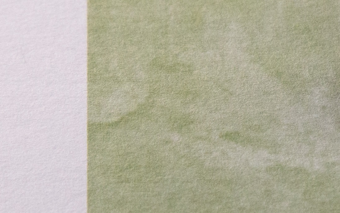
Rice Paper Texture
I decided to test this paper with a series of images of Winter Trees and Flowers which I thought would be perfect for this kind of paper. The images themselves are not too saturated and I was blown away with the results. I could not stop printing more images, I was having so much fun with the results. The relative Perceptual rendering intent ended up being the best choice for this set of images.
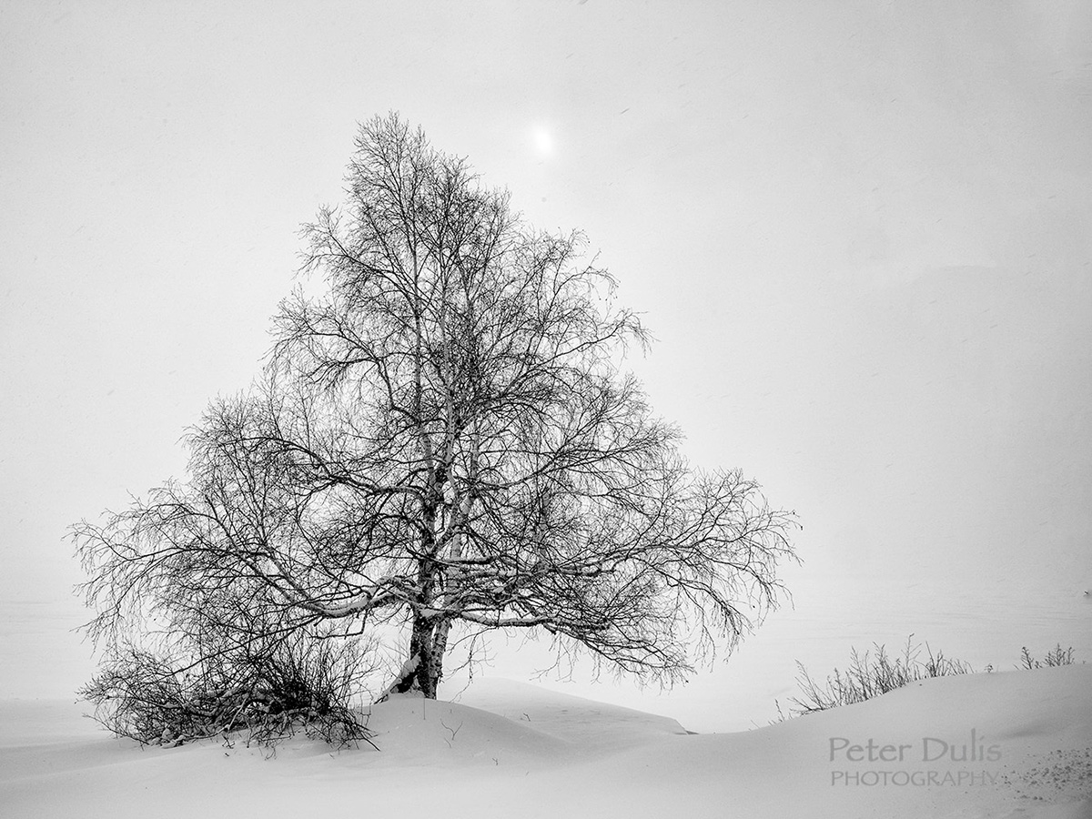
Winter Tree
I decided to test the Hahnemühle Rice Paper with a monochrome image of this winter tree. I was impressed with the paper’s retention of image detail. The grey scale toning was well reproduced and although the DMax is not as intense as the baryta papers, I was happy with the results. Perceptual rendering intent ended up being the best choice for this image. I think this paper is well suited to monochrome images and is truly a genuine art paper.
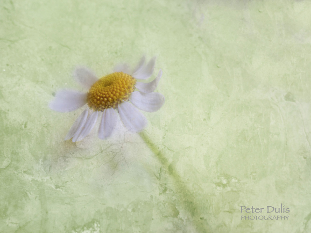
Feverfew Tansy
I choose this image because it was a mediumly saturated image. I thought this delicate art like image would be well suited to the Hahnemühle Rice Paper and I was not disappointed. I loved the colour rendition of this image as printed on the rice paper. The matt premium inkjet coating produced an excellent print result, with vivid colours and perfect reproduction of details.
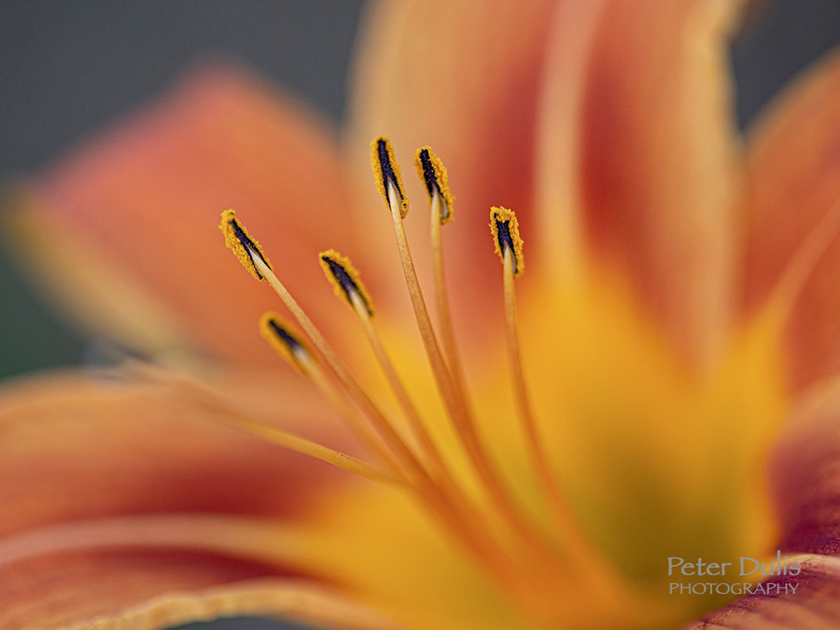
Tiger Lily
For the final image I wanted to choose a photo that had a vibrant coverage. For a matte paper, the strong colours reproduced well, not as vibrant as a luster paper, but none the less it was very nice. It had a slight buckling on the back of the paper due to the heavier ink load, but it was only noticeable on the back side of the print. The front print was gorgeous. The paper with its ultra-light, cellulose-based inkjet coating is especially nice for fine art applications and the white, lightly textured paper and soft feel make this paper truly stand out.
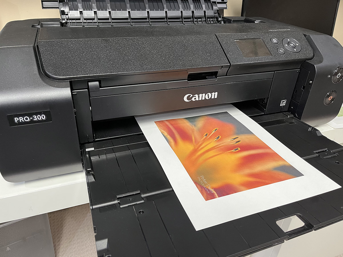
THE STEPS USED IN PRINTING ON A CANON PRO-300
The steps I used to print this series of images was easy. Although the paper is very thin, I had no issues loading the sheets into the top paper feed of my Canon Pro-300 and the printer fed them with no problems. Although it is a bit hard to discern which is the printable side, inkjet papers have a tendency to curl slightly towards the printable side.
Step One was to select the ICC media profile from the Hahnemühle download website and follow the instructions – Download Center.
Step Two was to choose File > Print
- Set Colour Handling to Photoshop Manages Colours
- Choose your paper’s profile from the Printer Profile drop down
- Select rendering intent (Relative Colourimetric or Perceptual)
- Check Black Point Compensation
Step Three was to click on printer settings and select the printer settings needed
- All Canon printers come with the functions you need to set the media type, print quality, and verify colour management is turned off at the driver level. (Alternatively, you can print with the FREE Canon Professional Print & Layout Plug-In that enables you to get professional photo printing results easier – love it)
- The OS will automatically disable the printer’s colour management
- Look for “Superfine” or “Photo” options for best quality
- And voila – Print!
ABOUT THE AUTHOR

Peter Dulis is a Canadian photographer and visual storyteller living in Toronto, Ontario. His work has been published in a number of magazines such as Graphic Arts Magazine, Visual Wilderness, Luminous Landscape, Photo News and has been recognized for photography excellence. Peter offers photo workshops in southern Ontario and can be reached at info@photographyAdventures.ca
Peter shares many of his tips and techniques in his monthly newsletter – PhotographyAdventures.ca and PeterDulisPhotography.com


Hello
I have heard alot about the Canon Pro300 however it is out of my budget at 1500$.
Would you recommend any of these:
Canon Pixma TR4720, TS3420 or TR7620A For quality photography colour or black and white photo printing?
Thank you
Leah
Hi Leah, the Pro300 is considered a professional solution for professional photographers, whereas the Pro-200 might be worth looking at as meeting photographer demands on a budget.
The TR4720 prints exceptionally well, making it a good choice for family rooms and home offices. (I have a TR4527 which I use at home for non critical color photos)
With the more professional printers, you get better color control and longer lasting archival prints – so it depends on what you are after?